Having trouble adjusting to Firefox 29? If Mozilla’s overhauled browser is giving you fits, then I suggest you turn to the Classic Theme Restorer extension.
I’ve been doing my best to like Firefox 29, but try as I might, I am not enjoying the latest version of Mozilla’s browser all that much. For starters, it looks too similar to Chrome, which has become a source of confusion as I use both browsers and like to be able to keep them straight at a glance. (Do your own thing, Firefox — don’t fall in line with the popular kid in browser school.) Also, familiar buttons have been moved or are just plain missing. And the thing is slow; on my admittedly aging MacBook Pro, it has been freezing at a much greater rate than the previous version, and Firefox 28 wasn’t great in this regard.
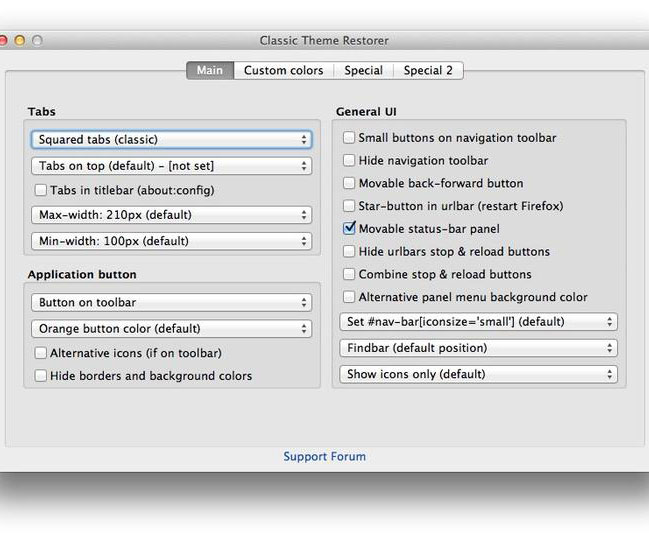
I want my old Firefox back, or at least some parts of it. I found an extension that offers a host of options to tweak the look and feel of Firefox 29, though I don’t have any tips on how to speed it up. The extension in question is Classic Theme Restorer. It offers a great many settings, and most of the time you can experiment with a setting without restarting Firefox. To access all that the extension can do, open your Add-ons page in Firefox and click the Preferences button for Classic Theme Restorer.
Allow me to share a few tweaks that I made with Classic Theme Restorer to make the new Firefox look and act a little more like the old Firefox.
Tab shape and location
The easiest way for me to distinguish between Firefox and Chrome is the shape of the many tabs I always have open in each browser. Curved tabs = Chrome. Square tabs = Firefox. It was a great system for me. With Firefox 29, it would appear that Firefox has got itself caught up in the curved-tab fab. So, the first setting you’ll encounter with Classic Theme Restorer is the shape of the tabs. You have three styles of square tabs from which to choose as well as two styles of curved tab.

In another seemingly Chrome-inspired move, Firefox 29 also moves the tabs above the URL bar. Classic Theme Restorer lets you move the tabs to their rightful place below the URL bar if you so choose. You can also set maximum and minimum width for tabs, but I think the default setting works just fine.
Missing: Tab close button
More than the new shape and location of tabs in Firefox 29, my biggest beef is the “X” button that goes missing from the right side of each tab. It disappears from all but the active tab when you add enough tabs to start shrinking the width of the tabs. This means that you must click to open a background before clicking again to close it. Before, you could simply click the “X” on a background tab to close it.

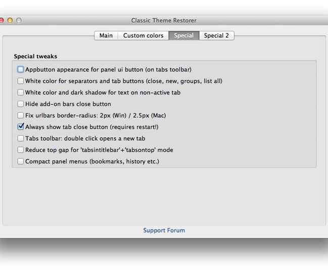
Thankfully, Classic Theme Restorer lets you show the “X” button on all tabs, no matter how many tabs you have open. Click on the Special tab in the Preferences window and check the box for “Always show tab close button.” And note: this setting is one of the few that requires a restart before taking effect.
Star button: Not a favorite
Firefox 29 adds a star button to the left of the URL bar. You can click this to bookmark the current page, but I rarely bookmark pages, and when I do I use Command-D (or Ctrl-D on Windows). Thus, to my eye, this star button is just taking up space. To get rid of it, head back to the Main tab of of the preferences window. In the General UI section on the right, check the box for Star-button in URL bar. This setting, too, requires a restart before taking effect.
These are just a handful of settings that can be tweaked with Classic Theme Restorer. Are there things about Firefox 29 that are driving you nuts? And was Classic Theme Restorer able to help? Let me know in the comments below.


